

I designed a platform that connects Rabobank’s sustainability consultants with SME clients to support the bank’s ambition of driving the green transition. The platform consists of an online assessment that calculates each SME’s environmental footprint, an SME portal where clients can access and review their results, and a consultant portal where Rabobank advisors can track and manage outcomes. Following a Design Thinking approach, I conducted exploratory research to uncover needs and pain points, facilitated a stakeholder workshop to align on challenges, developed and iterated multiple design solutions, and validated them through preference testing.
Lorem ipsum dolor sit amet, consectetur adipiscing elit. Suspendisse varius enim in eros elementum tristique. Duis cursus, mi quis viverra ornare, eros dolor interdum nulla, ut commodo diam libero vitae erat. Aenean faucibus nibh et justo cursus id rutrum lorem imperdiet. Nunc ut sem vitae risus tristique posuere.
Aligned with the EU's climate targets, Rabobank has set ambitious goals to curtail carbon emissions. By 2030, the bank aims to achieve a significant 55% reduction in carbon emissions, while striving for complete carbon neutrality by 2050.
Rabobank initiates contact by reaching out directly to SMEs. If an SME shows interest, they are directed to a landing page with more information. After this step, Rabobank consultants provide an Excel sheet filled with detailed questions about the SME’s business activities in order to assess their sustainability performance.
This process was not user-friendly and created friction for SMEs. The reliance on a lengthy Excel file made data entry cumbersome, while the need for continuous consultant guidance placed a heavy burden on Rabobank’s internal resources.
To scale its green transition strategy effectively, Rabobank required a solution that could streamline data collection, reduce dependency on consultants, and deliver a more accessible, engaging experience for SMEs.
Lorem ipsum dolor sit amet, consectetur adipiscing elit. Suspendisse varius enim in eros elementum tristique. Duis cursus, mi quis viverra ornare, eros dolor interdum nulla, ut commodo diam libero vitae erat. Aenean faucibus nibh et justo cursus id rutrum lorem imperdiet. Nunc ut sem vitae risus tristique posuere.
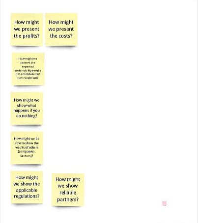
Organizing a workshop with relevant stakeholders to discover main issues in the process.
Identifying and prioritizing the main issues to work on first.
Creating design proposals based on information collected during the workshop and following best practices.
FInalize the designs based on the users’ feedback.
I tracked SME entire journey, starting from when the Rabobank consultants first reached out to them, all the way to when they receive their sustainability performance. After that, I organized a workshop and invited Rabobank’s consultants, project managers (PMs), and product owners (POs). The purpose of the workshop was to uncover problems in each stage of the journey and brainstorm snappy solutions that could be turned into features to test out.
.avif)
After spending significant time answering detailed questions about their business, SMEs arrive at the results page with one expectation: clarity. This is the make-or-break moment — if the insights feel vague, overwhelming, or hard to act on, users lose trust and disengage from the platform entirely. The design goal was to turn this critical touchpoint into a rewarding experience: one that feels worth the effort, builds confidence in the platform, and keeps SMEs engaged with Rabobank's sustainability programme long-term.
%2B1.jpg)
.avif)
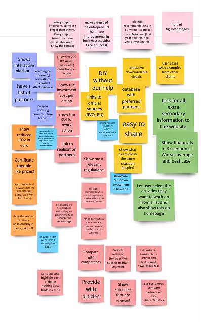
I designed two distinct proposals for the results page, incorporating all the insights gathered during the workshop. Both designs were crafted with the specific needs of the target audience in mind. To inform these proposals, we created proto-personas based on data collected from conversations that Rabobank sustainability consultants had with SMEs, ensuring the solutions addressed real user behaviors, goals, and pain points. This de-risked the product by aligning the UI with actual market needs, not just assumptions.


To evaluate the effectiveness of the two design options, I conducted preference testing to identify which variant would perform better, result in higher conversion rates and better support SMEs in progressing to the next steps. Adopting a qualitative approach, I collected feedback from 16 end users to uncover insights into their preferences, behaviors, and decision-making patterns.
Tested the sustainability advisor dashboard
Tested the CEO dashboard
Tested the CEO dashboard
Tested the sustainability advisor dashboard
“There is too much text, I don’t have the time to read all of it, just give the highlights and the option to read more”
“I don’t understand this pie chart, isn’t the goal to reach 55% sustainable energy by 2030? This pie chart seems to be saying we gotta go all the way to 100% sustainable”
“What does this timeline indicate? I clicked on it but nothing happened”
“The colors used in the pie chart are misleading. I see blue and orange are used for different topics ”

Analysis of the results revealed that the sustainability advisors dashboard was the most effective solution. Its success was measured by the number of SMEs indicating their willingness to schedule an appointment with a Rabobank sustainability consultant, reflecting a clear intent to move forward in the process.
I incorporated all feedback to develop a new dashboard variant that combined insights from both Proud Paul and Involved Ingrid, aiming to enhance conversion. To validate its effectiveness, I conducted a comparative preference test against the sustainability advisor dashboard, evaluating their respective conversion rates.
%2B(1).avif)
“I would like to see what is the ROI for each of these actions”
“I really like this pie chart, it gives me a clear picture of the investment amount, the sustainability impact, and the timeline involved”
“I want to know more about the financial investment so I think I would like to schedule a call with a consultant”
“Would it be possible to make a comparison with other suppliers to pick the best one? ”
I synthesized end-user feedback to revise and merge the two designs into a unified solution. I then developed the design components and collaborated closely with developers, overseeing implementation to ensure fidelity to the intended user experience.
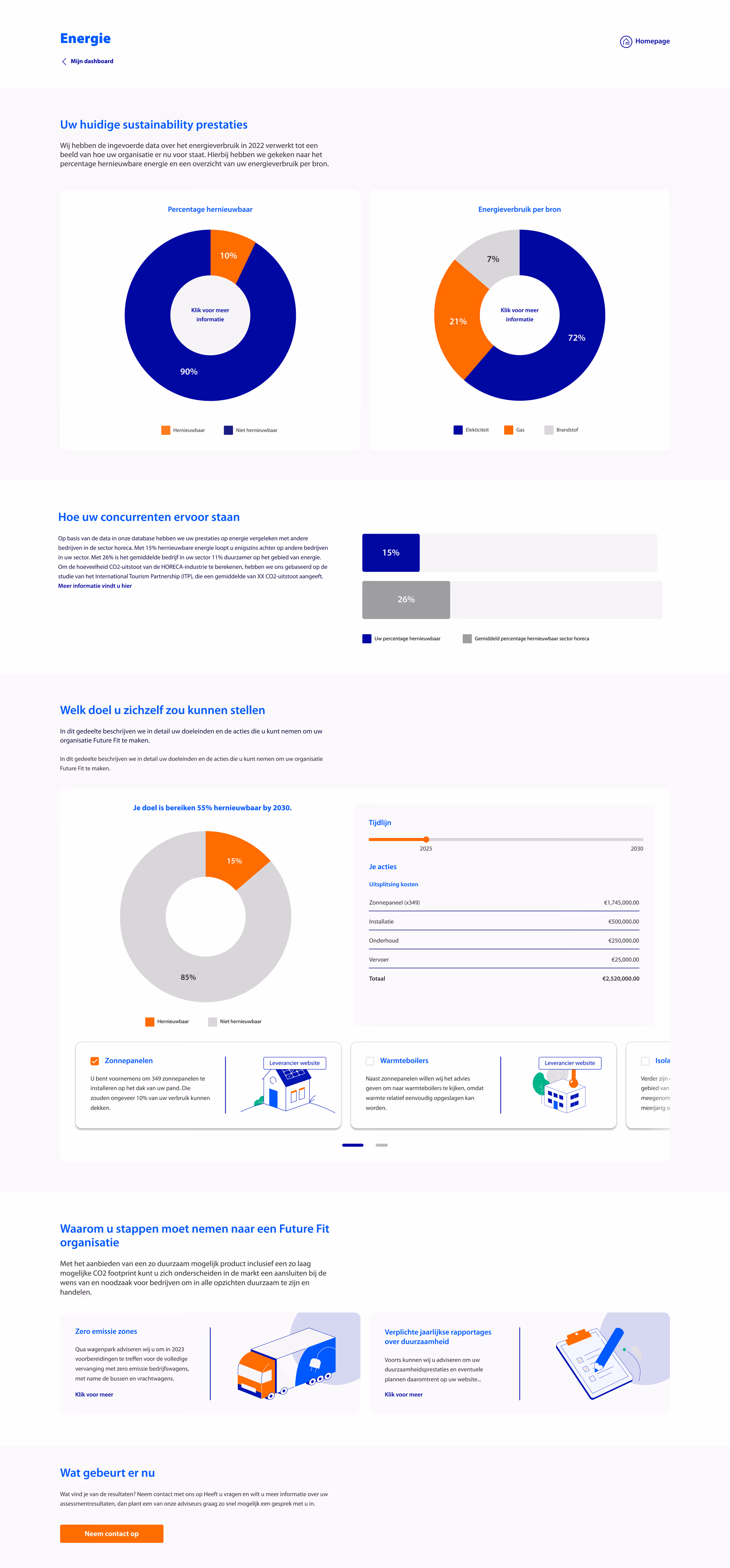
The graphs present the user's current sustainable performance, based on data collected from a questionnaire previously filled in.
%2B(1).jpg)
The users are able to compare their sustainability performance with the sustainability standards of the industry they belong to.
%2B(1)%20(1).jpg)
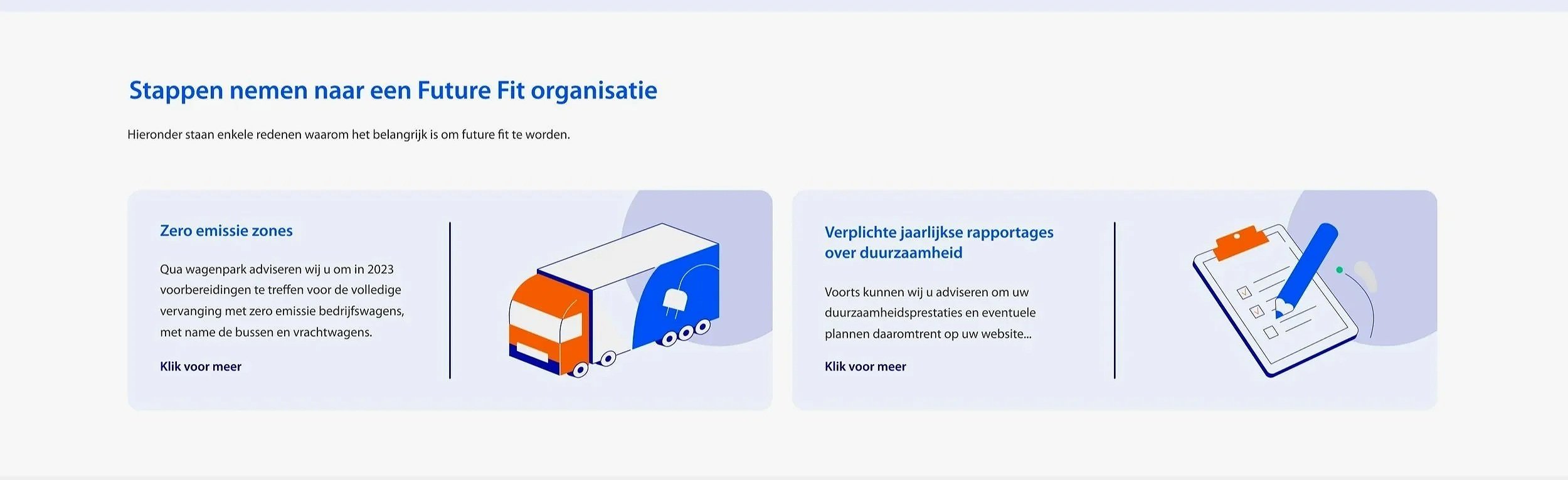
This section highlights actionable steps to reduce the business's environmental impact and its impact on achieving the goal of a 55% CO2 reduction by 2030.
%2B(1)%20(3).jpg)
Here, the users can check which sustainability policies or regulations will have a direct impact or their business in the short and long term.
At the end of the report, users can either contact a consultant or take another assessment.
%2B(1)%20(2).jpg)
Designed Quatt website and it’s sales conversion funnel leading to €15k p/m sales in the Netherlands.

Designed from scratch one of biggest B2B e-commerce platform in Thailand.
Designed a B2B assessment and advisory service to help Rabobank’s clients decrease their CO2.
