Novacolor
B2C Marketplace
Novacolor is internationally known as a reference point for high-end architectural coatings and interior paint effects. The Company offers to architects and designers worldwide a complete assortment of textured effects and polished plasters, for interiors and exteriors, as well as wall coatings for modern or historical town settings.
ROLE: UX/UI Designer
TEAM: 2 designer, 1 PM, 2 developers
DURATION: 3 months
SUMMARY: Novacolor required a website redesign to enhance brand visibility and give their platform a more contemporary appearance. Collaborating with Novacolor's project manager, we worked on aligning content, components, and design. My role involved creating a fresh look and feel, developing a components library, and crafting a visual design style guide for both mobile and desktop devices, using the existing website as a foundation.
The approach
1.
Competitors benchmark
Run competitors benchmarks to analyze direct and indirect competitors and find inspiration.
2.
Sitemap
Organizing, structuring and labeling content in an effective way with the aim of helping the end user to find information and complete tasks.
3.
Wireframing
Create low fidelity wireframes making sure to include all the components and to respect the hierarchy between the elements.
4.
Modular system
Create a modular components library including components that can be easily reused and changed for future improvements.
1. Competitors benchmark and moodboard
To create the competitors benchmark I started by analyzing direct and indirect competitors, paying attention at how their websites are organized, which widgets they use and the overall UI, in this way I could pinpoint strengths and weaknesses of each. Finally, I realized a moodboard to capture the client’s preferences and to showcase interesting web components.
2. Sitemap
After having analyzed and researched competitors was time to build the website skeleton. Novacolor was also creating new contents with the aim of increasing brand awareness. For this reason it was necessary to integrate new content pages with the skeleton of the website redesign built based on the competitors analysis.
3. Wireframing
I used low fidelity and afterwards high fidelity wireframes to structure content and give to the client a taste of what the final result would look like. To create the designs I used tools such as Illustrator and Sketch.


4. Modular System
For the different web pages I designed interchangeable and reusable components for quick scaling in a modular system.
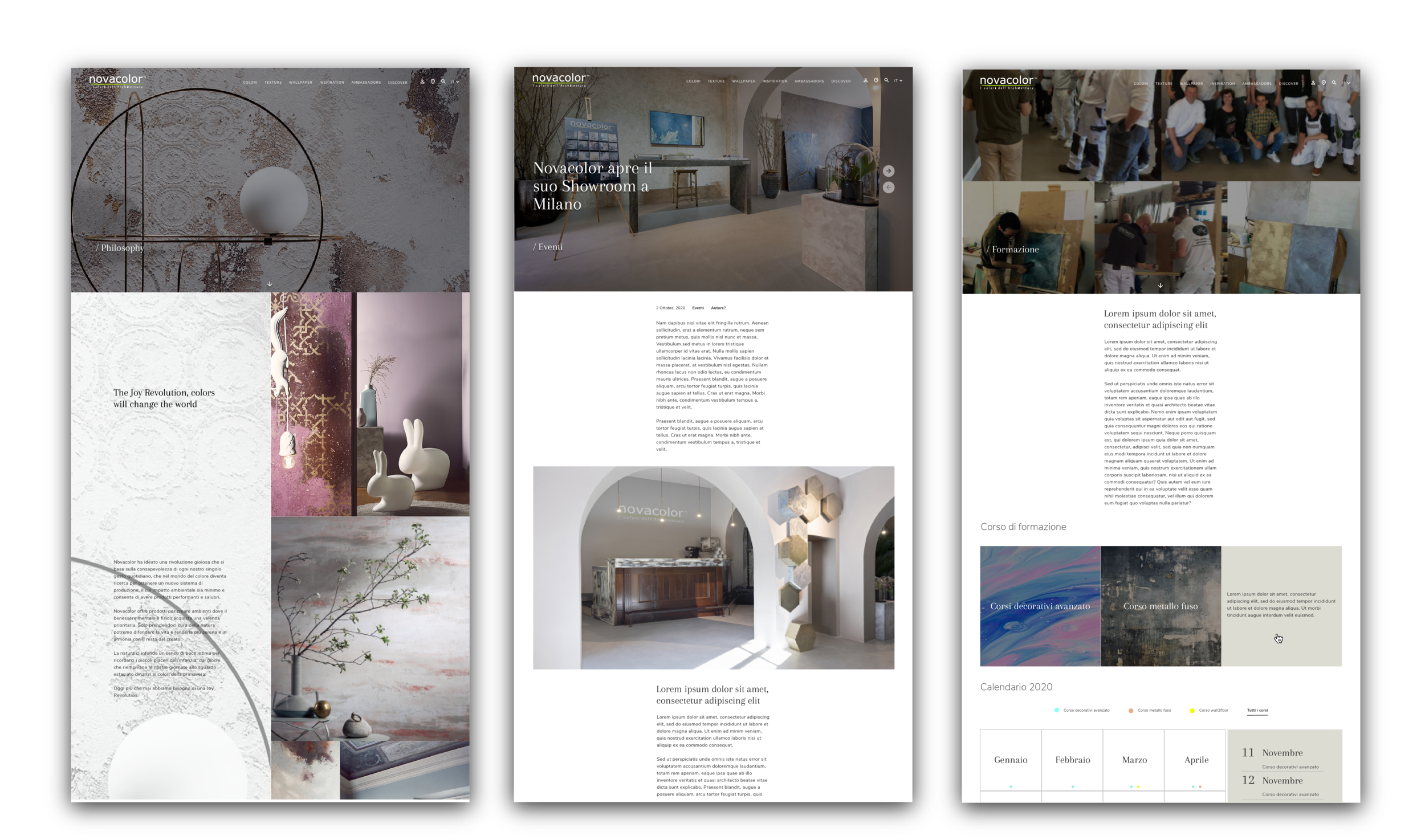
High-fidelity mockups
Here can be found few high-fidelity mockups for mobile and desktop devices. The website will be soon accessible online.
Style-guide
I prepared a style-guide template that summarizes the choices made in terms of typography, colors and icons.
Learnings
This project was very hands on and iterations on the design happened throughout the project lifecycle. For this reason I find it useful to develop a modular system which allowed me to quickly make changes and present them to the client without disrupting the overall layout.


