ClubLeaf
Environmental Service
ClubLeaf is a B2C digital service that offers users the opportunity to offset their CO2 emissions. Through various monthly subscription plans, users can directly contribute to certified environmental projects across the globe. These projects encompass initiatives such as reforestation, clean energy investments, and the installation of cookstoves in developing nations. By subscribing to ClubLeaf, users actively support these initiatives.
ROLE: UX/UI Designer
TEAM: 2 designers, 2 POs, 4 developers
DURATION: 6 months
SUMMARY: At ClubLeaf our aim was to develop a mobile platform compatible with iOS and Android. I conducted user and competitor research, interviewed potential users, and collaborated closely with developers, product owners, and founders using the SCRUM framework. User testing with real users allowed for iterative design improvements based on feedback. Additionally, I managed and updated the design system to expedite development processes.
LINKS: Link to Google Store
Re-designing Club Leaf
When I joined the Club Leaf project the app had been live on Android and iOS for 6 moths. This project was at it’s early start-up stage, meaning that design work has been done and a roadmap was already defined for the next quarters. My role as UX designer was to deliver new features, maintain the website updated and create social media content.
The approach
1.
Competitors research
Running a competitor research to understand the market and analyze what the most successful do better.
2.
Development
Developing first design iterations based on insights collected during the competitors research.
3.
Testing
Organizing, running usability tests with potential users and analyze the insights.
4.
Discovery February
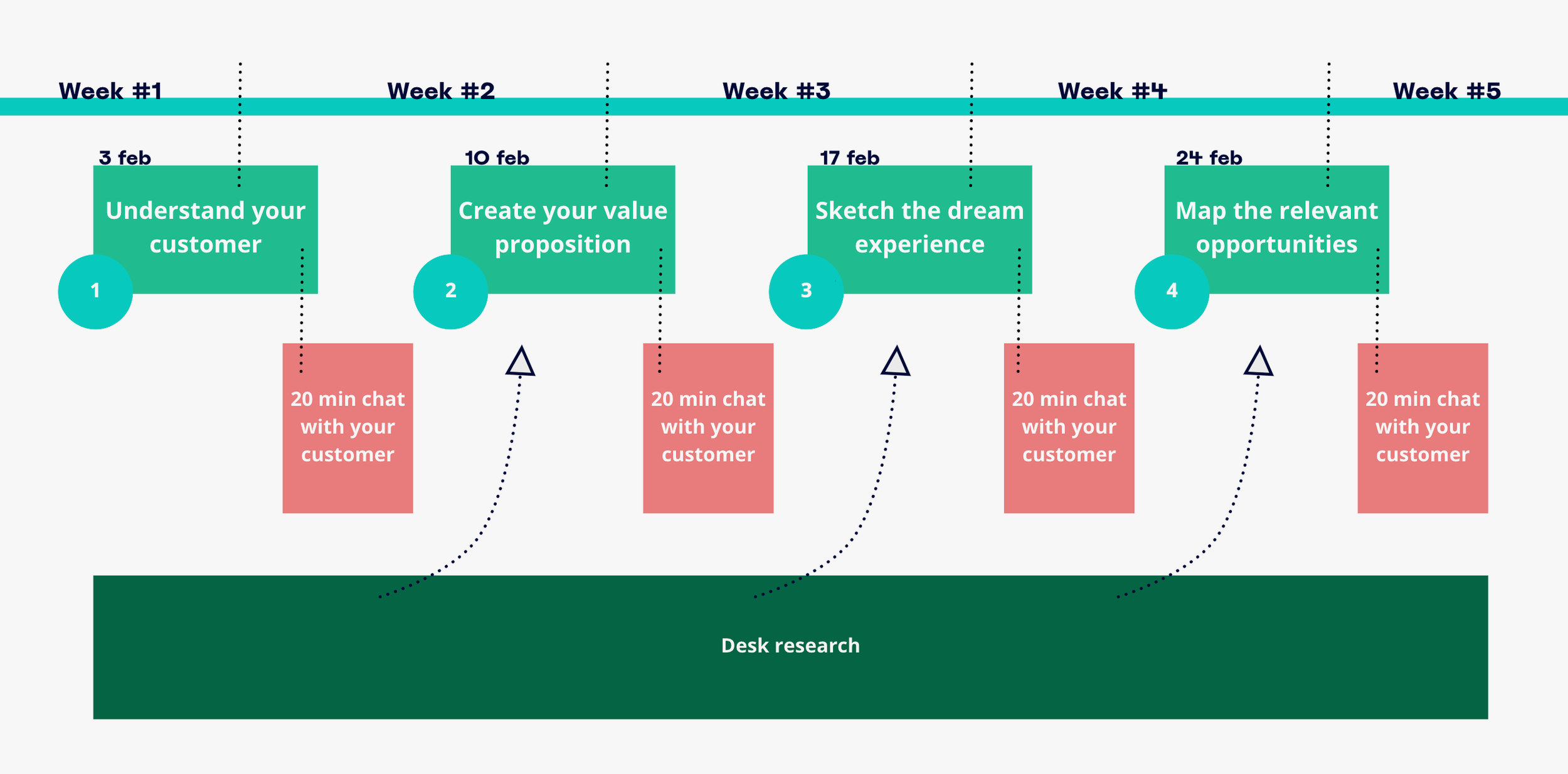
Organizing, supporting and facilitating a month of user research and desk research to better understand target audience.
1. Competitors research
For the competitors research I focused on services that have a similar offer compared to Club Leaf. I identified the most popular apps and analyzed them. I read the reviews to check positive and negative comments, I identified the highlights and the learning points for each feature and shared them on a Miro board with the team.
Miro board
Results from the competitors research:
Most successful apps offer less features
Most successful apps tell a simple story
Flat and clean UI is popular
2. Development
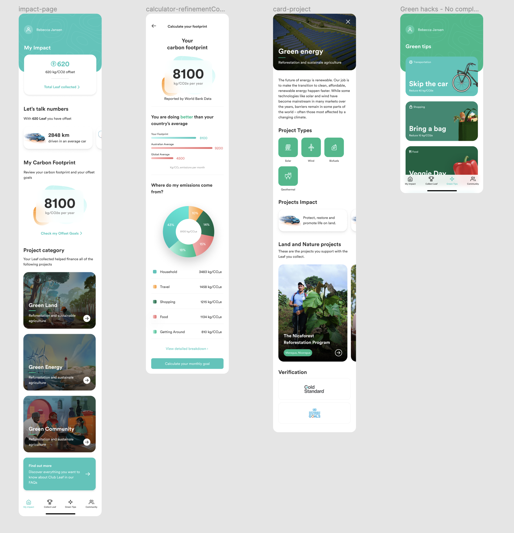
After the competitor analysis I worked on improving overall clarity of the app by:
Restructuring the information hierarchy of the app
Setting up a design system (spacing, fonts and grid)
Removing redundant information


3. Testing
I user tested the main sections of the app to understand if the users would understand Club Leaf proposition by landing into the app after the onboarding. I recruited 5 new users that did not use the app because current users could use prior knowledge to understand the new design. The interviews were conducted via Zoom where an interactive prototype was shared with the participants while they were asked questions.
Results from the interviews
From the interviews I draw the following conclusions:
Users do not understand difference between offsetting and reducing CO2 emissions
There is an overwhelming amount of information
General lack of structure and interactivity
4. Discovery February
The goal of Discovery February was to better understand the motivational drivers that our target users use to make sustainable decisions and understand the biggest challenges they face in living a sustainable life.
In a nutshell
A month of research to understand our users and build a stronger brand proposition.
32 interviews with potential users to understand sustainability habits
40 hours of desk research around topics such as: behavior change, gamified rewards, Gain and retain trust
4 workshops
Results of Discovery February
Keep in Simple Katie represents Club Leaf target audience, their needs, their pains, and their goals.
Low effort
Quick and easy to digest information pills
Transparency
5. Moonshot
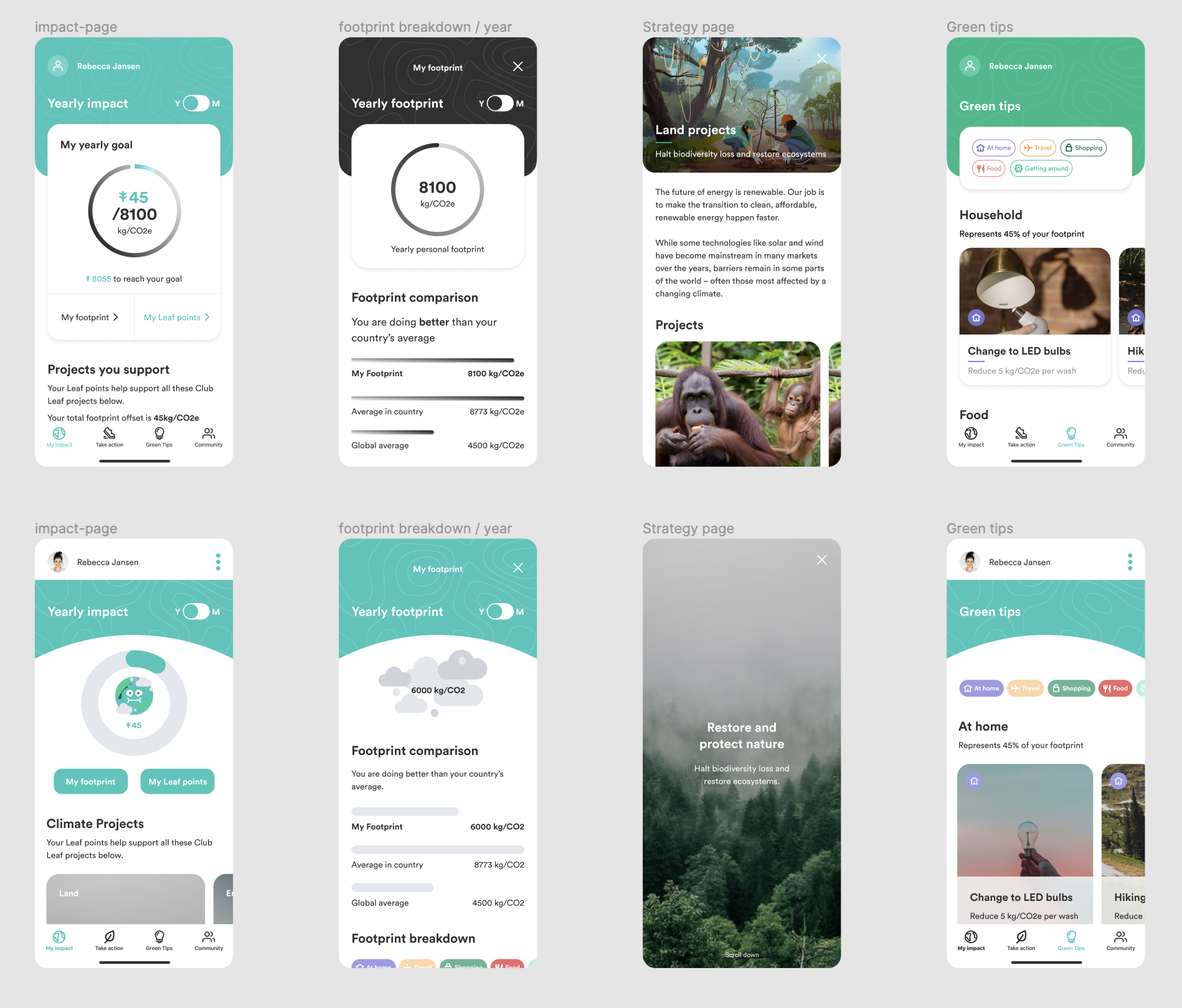
Based on the new user research outputs I proposed the Moonshot initiative. A complete redesign of the app, taking into consideration Keep it Simple Katie needs, pains and goals.
Based on the research I proposed a new design that focused on:
Lower the cognitive load of the users
Increasing readability by polishing the visual clutter
Increase engagement


