Bulgari
INDUSTRY: B2C Marketplace
MONTHLY TRAFFIC: 18k users
WEBSITE: https://www.bulgari.com/en-int/
Bulgari is one of the world's leading manufacturers and marketers of luxury goods. From its traditional emphasis on the highest-quality jewelry and watches, the company has expanded into perfumes, silk scarves, and eyewear.
ROLE: UX/UI Designer external collaborator
TEAM: 1 UX/UI designer, 2 developers, 2 POs, 1 PM
SUMMARY: As an external collaborator for Bulgari, I supported their internal product team, which lacked a dedicated UX designer. Working closely with project managers, I provided UX best-practice guidance and delivered design solutions from initial sketches to interactive prototypes. My work covered both mobile and desktop experiences, including: Product Detail Page (PDP) redesign, transactional emails (purchase & delivery confirmations, newsletter subscriptions), a custom icon set, multiple modal pages, shopping features such as “Shop the Look,” product bundles, and quick-purchase sticky bars.
The Product Detail Page (PDP)
The Product Detail Page is where all the main information about the product can be found by the end user. To design the Product Detail Page I iterated on the design requirements given directly by Bulgari and I conducted competitors research to understand which trends and components are most effective in the luxury e-commerce industry. Both mobile and desktop versions were built making sure that the shopping experience is consistent on any device.
THE PROCESS
Understand Bulgari’s needs and technical limitations.
1.
Client brief
Understanding and questioning the client’s brief to gather insights about the new project.
2.
Competitors benchmark
Run competitors benchmarks to analyze direct and indirect competitors and find inspiration.
3.
Design proposals
Deliver conservative and innovative high end prototypes proposals to the client making sure that the designs follow WCAG guidelines and meet AA or AAA accessibility standards.
4.
Handover delivery
Deliver the handover files that include: PDF describing functionalities and technicalities of the components and PSD files for the development team.
1. Bulgari’s briefs
For the PDP project, I worked in direct collaboration with Bulgari’s project managers. When internal departments — including Marketing, Omnichannel, Digital, and Data Analytics — submitted requests for updates to the PDP, I translated these into a new design brief and developed the corresponding design solutions.
2. Competitors benchmark
Bulgari needed to add several new features and sections to its PDP, including Bulgari Craftsmanship & Design, Bulgari Services, and Bulgari CSR. To inform the team and gather inspiration, I conducted a competitive benchmark analysis, focusing on both direct and indirect competitors.
Run a competitors benchmark
To run a competitors benchmark I listed direct and indirect competitors on an excel spreadsheet. On each column I defined a list of criteria to analyze focusing on: first 5 seconds impression, interactions, product information hierarchy, multimedia usage, extra features. The main competitors identified were: Armani, Morellato, Pandora and Dolce&Gabbana.
Key insights from the benchmark:
➡️ Storytelling & heritage: Luxury competitors often highlight craftsmanship and brand heritage to reinforce exclusivity and trust.
➡️ Service visibility: Services such as delivery, engraving, or returns are made highly visible, reducing friction in the buying journey.
➡️ CSR positioning: Competitors integrate Corporate Social Responsibility messaging to strengthen brand values and connect emotionally with users.
➡️ Visual hierarchy: Successful layouts dedicate prime space to visuals while supporting content with concise copy and expandable sections.
3. Design proposals
For each new PDP feature or section, I created multiple design proposals using Sketch and InVision. Each proposal was accompanied by a presentation outlining the design rationale, ensuring stakeholders understood the reasoning behind my decisions and could make informed choices.
Re-designing the PDP first viewport
Current PDP
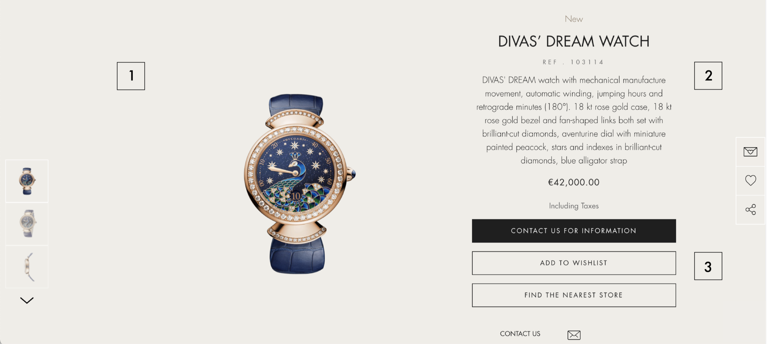
Image gallery: The current hero image is misaligned with the surrounding product information. The carousel gallery on the left is also misaligned relative to the hero image, creating visual inconsistency.
Product information: For certain items, the product description is too long, taking up excessive space in the first viewport. The same description is repeated in the “Description and Details” section below, resulting in redundancy and a repetitive user experience.
Product options: Due to COVID-related adjustments and internal business requirements, there is a need to add several additional product options.
Proposed PDP
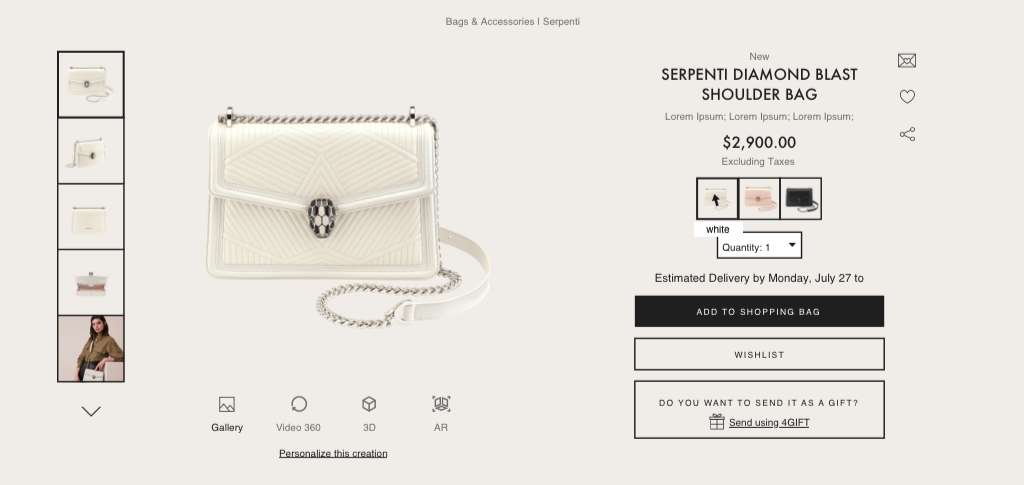
Image gallery: All elements have been realigned to the new page grid for consistency. The hero image was enlarged to give the product greater visibility. A new multimedia carousel was added below to showcase additional product content.
Product information: The product description was moved exclusively to the “Description and Details” section below the first viewport. This change provides Bulgari with more space for longer descriptions while allowing images to take priority in the initial view.
Product options: Additional product options were introduced. Users can now expand the menu to explore all available options. This solution gives Bulgari the flexibility to add more options within the dropdown menu without disrupting the overall page layout.
4. Handover delivery
For each feature or section selected by Bulgari, I delivered a PDF handover document detailing:
➡️ The design rationale behind the solution
➡️ Element behaviors and expected user interactions
➡️ Technical specifications to support development
In addition, I provided Photoshop files of the final designs to ensure smooth implementation.
High fidelity mockups
Below can be found some examples of high fidelity mockups realized using Sketch.
Accessibility improvements
Before ➡️ After
Image Thumbnails: Low-contrast white borders ➡️ High-contrast thick black borders for clarity.
Typography: Thin, light fonts ➡️ Thicker, darker fonts with WCAG-compliant contrast (≥4.5:1).
Multimedia Options: Icons without context ➡️ Written labels to identify gallery content types.
Color Selection: Color swatches only ➡️ Mouseover labels with clear product color names.
Atomic Design
To design the different components I used the atomic design methodology. In the natural world, atomic elements combine together to form molecules. These molecules can combine further to form complex organisms.
Personalized icons
I designed two sets of personalized icons for Bulgari to be included in their services. The sets are composed by bold and slim versions of the icons.
Learnings
💡 Collaboration and accessibility
Working with Bulgari taught me how to collaborate effectively with diverse stakeholders, including project managers, data analysts, marketers, and developers. In addition, I gained valuable experience in ADA compliance and the practical implementation of accessibility standards within my design work.


